Designer Loves: HBA Residential
 As part of its First Look initiative, and as a preview to London Design Week 2021, the Design Centre asked top designers to choose their favourite products from this season’s new collections. Anoushka Almeida, design director of HBA Residential, selects her edit below and explains her thoughts on colour – including the one shade she is obsessing over right now.
Is there a particular piece out of the products you’ve chosen that you can’t wait to put in a scheme? How do you envision using it?
Alexander Lamont’s ‘Shangó’ lamps would look great as a pair against a curated minimalist scheme, perhaps either side of a mantel or fireplace. This lamp is both architectural and handcrafted, and I imagine it would hold ground and stand out beautifully like a sculpture.
Did you discover anything on the First Look colour wheel that surprised you?
Green is usually quite a contentious colour when it comes to interior schemes: it’s sometimes a bit hit or miss and can be hard to tick the box with clients. It was good to see some tasteful variants of it on the First Look colour wheel that inspire and are very usable.
Is there a colour you are consistently drawn to in your work?
Every project will generally draw on colour schemes that have a relevance to the surroundings; we also take into account any cultural references, history and function, and colours may also be quite personal to a client. I really like to use a strong natural core palette that is still quite luxurious, so that the richness and tones of the materials speak for themselves. That way you can build and develop any colourway on top to complement and/or contrast. Personally though, I am always drawn to deep earthy colours like russet, ochre and tan, and like to team this with dark shades and navy tones for a warm contrast.
What timeless colour should we all be embracing this year?
Navy. I am obsessing over it a little at the moment. I feel it’s a different, perhaps more sophisticated option to a black or dark brown, and it works so well to lift most light and dark colour tones for interiors as well as fashion.
See these products in person at London Design Week 2021 (16-21 May): register here
-
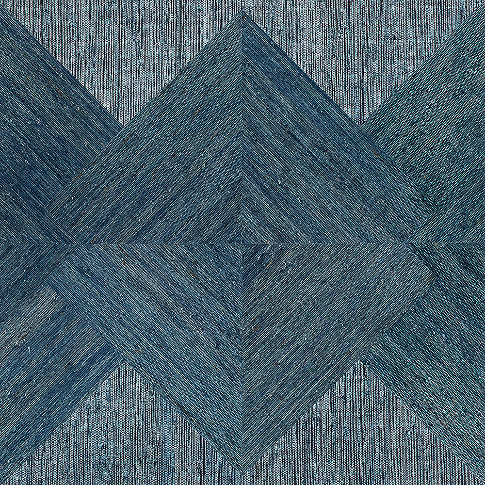
- ‘Arrowroot inlay’ wallcovering, Phillip Jeffries: “This range of inlay wallcoverings feels very ‘tailored’ and they are always a winner for adding deep accent colours to powder rooms”
-
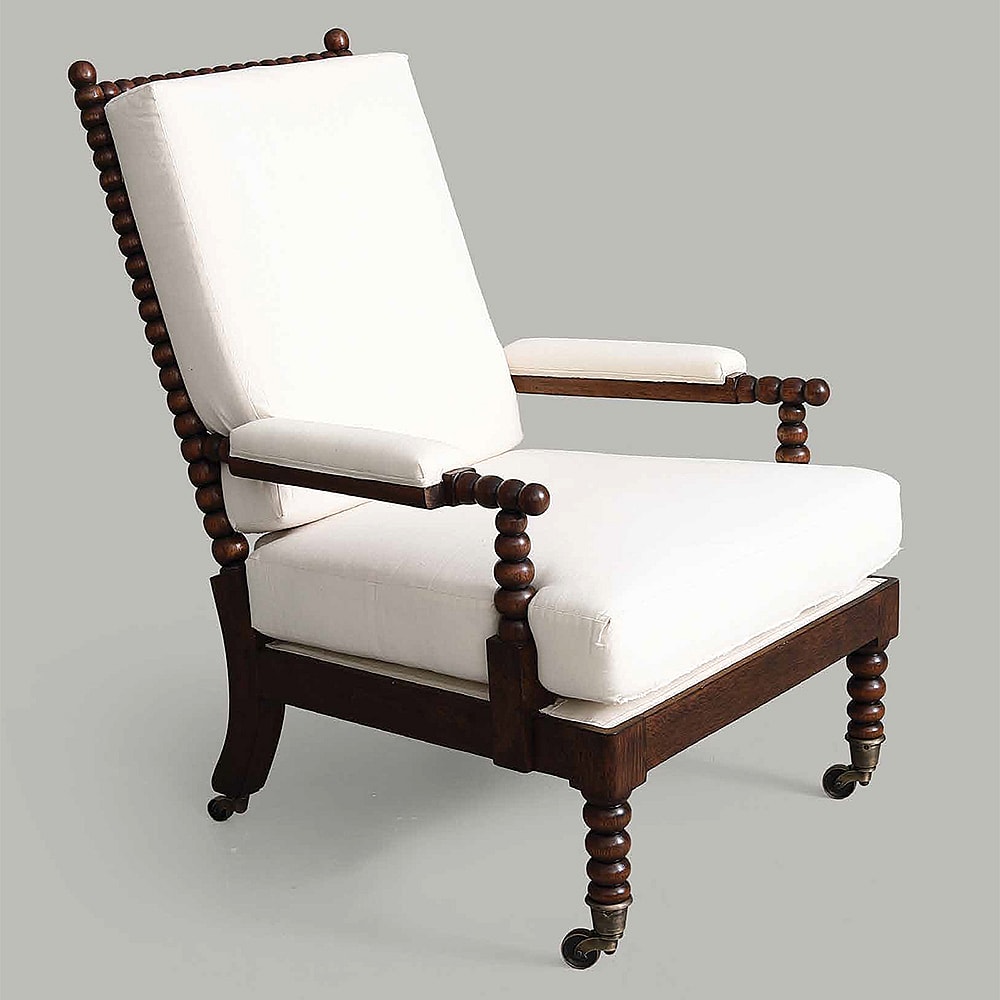
- ‘Broughton’ chair, Vaughan: “I really like this fresh contemporary version of a European 19th-century bobbin chair. This would look great in a home library or entrance lobby”
-

- ‘Shangó’ floor lamp, Alexander Lamont + Miles: “I love how the use of bright onyx contrasts against the strong grounded dark column. The use of light also plays with translucency of the onyx, creating more interest and beauty within the lampshade”
-
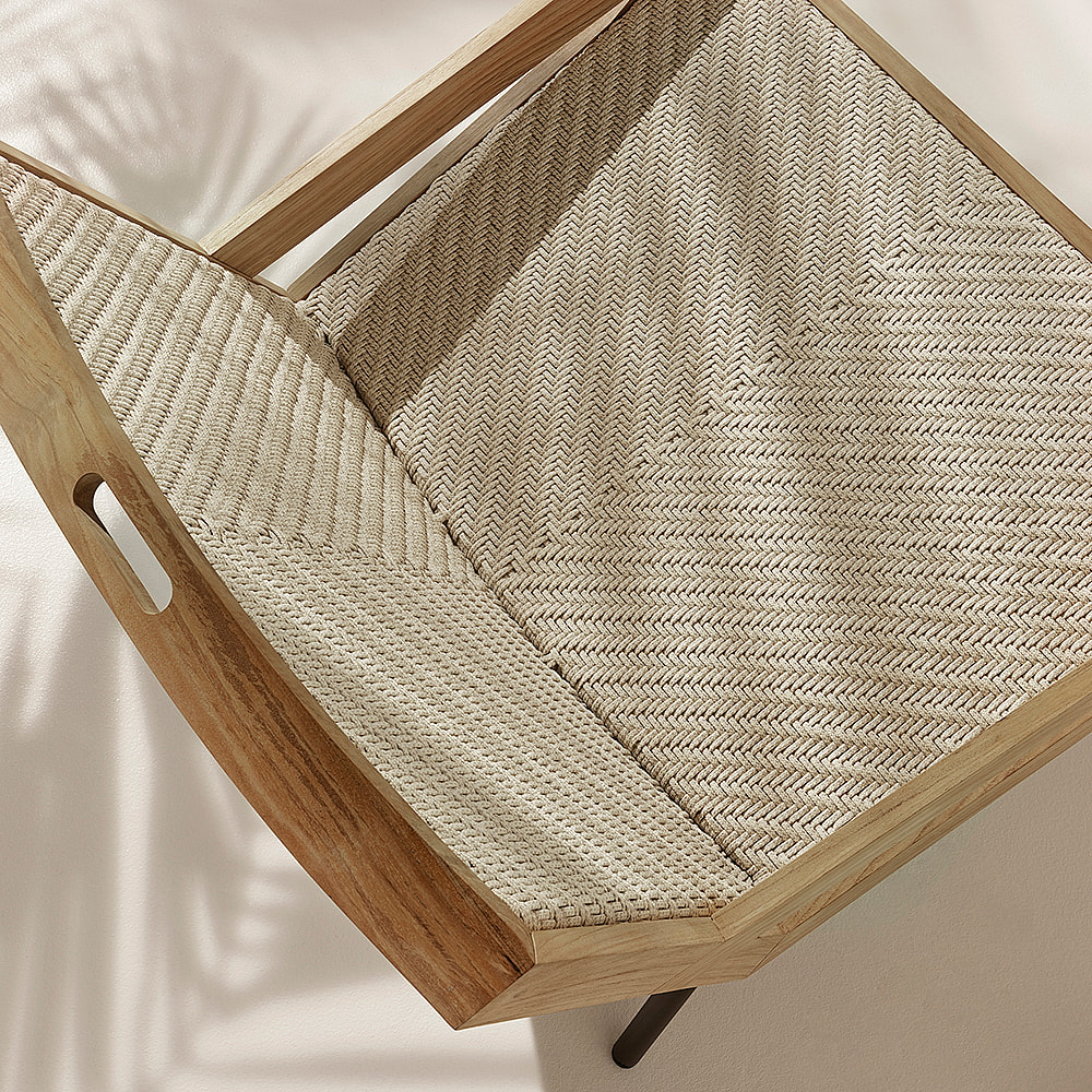
- ‘Allaperto Nautic’ lounge chair, Ethimo: “This has a beautiful form created out of a couple of very simple materials. Having a background in woven textile design, I am always fascinated to see how something complex and functional can be handcrafted and constructed out of natural fibres and a timber frame!”
-
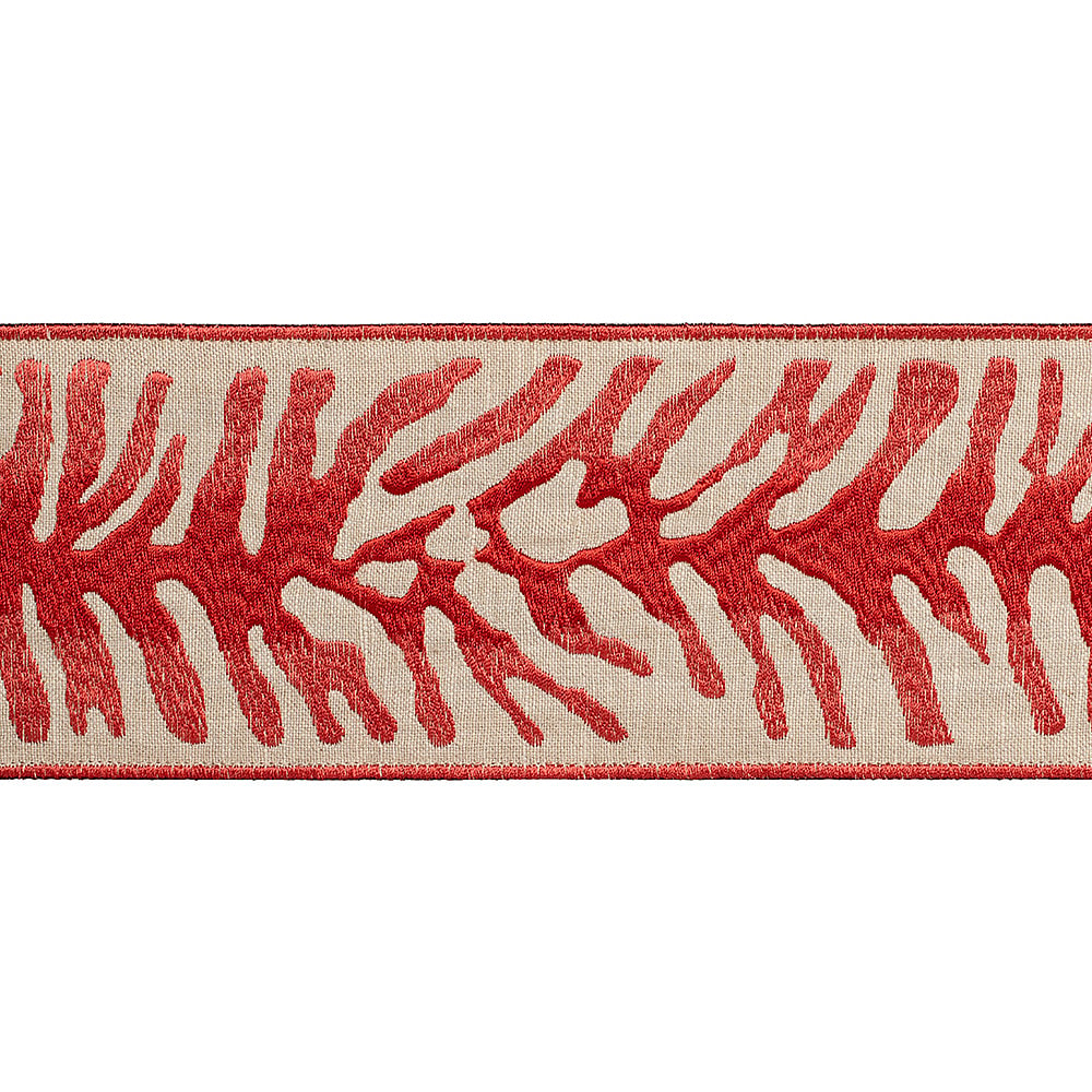
- ‘Tahiti’ border, Samuel & Sons: “We have specified a few of these fun Samuel & Sons designs on recent projects and they are such a good way to add detail to upholsteries and draperies. It’s also a great way to add subtle layers of colour within a scheme if a client is apprehensive…”
-
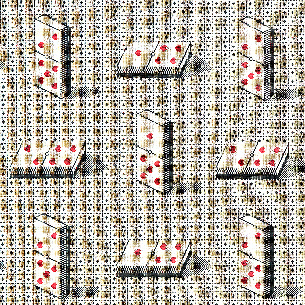
- ‘Domino Epingle’ fabric, Schumacher: “This fabric would be perfect for upholstered chair-backs in an entertainment room for one of our clients who loves poker games and Alice in Wonderland”
Alexander Lamont + Miles, Second Floor, South Dome
Ethimo, Third Floor, Centre Dome
Phillip Jeffries, Second Floor, North Dome
Samuel & Sons, Third Floor, Centre Dome
Schumacher, Ground Floor, South Dome
Vaughan, Ground Floor, Design Centre East