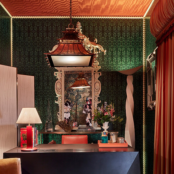
You Saw It Here First…
WOW!house is a showhouse rather than a real home, which means that its designers have been able to let their imaginations fly, perhaps going bigger, bolder and more extreme than they might for a real-life client. However, it is also full of ideas that are transferable to any home – and providing design inspiration to take away is one of the show’s core purposes, and the reason so many visit.
Just as at the first WOW!house in 2022, this year’s rooms also revealed some common threads that act a barometer of what designers are loving, and in turn, what the future might hold when these themes trickle down to a wider audience. When you catch them, remember to say that you saw it here first…
The colour swatch to watch
Designer Timothy Mather said that he wanted his Day Room (sponsored by Miles + Alexander Lamont + Lauren Hwang New York) to capture the mood of a room when the sun sets, using luxurious silk-wrapped walls to create that feeling of gentle warmth. The walls’ ochre colour – like gold, but without the metallic finish – was a hue that appeared in many of WOW!house’s other rooms.
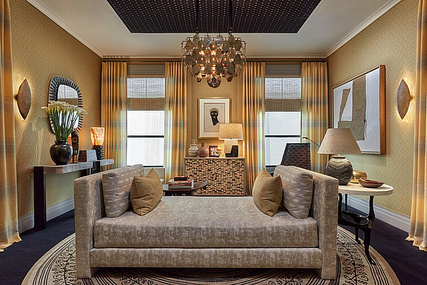
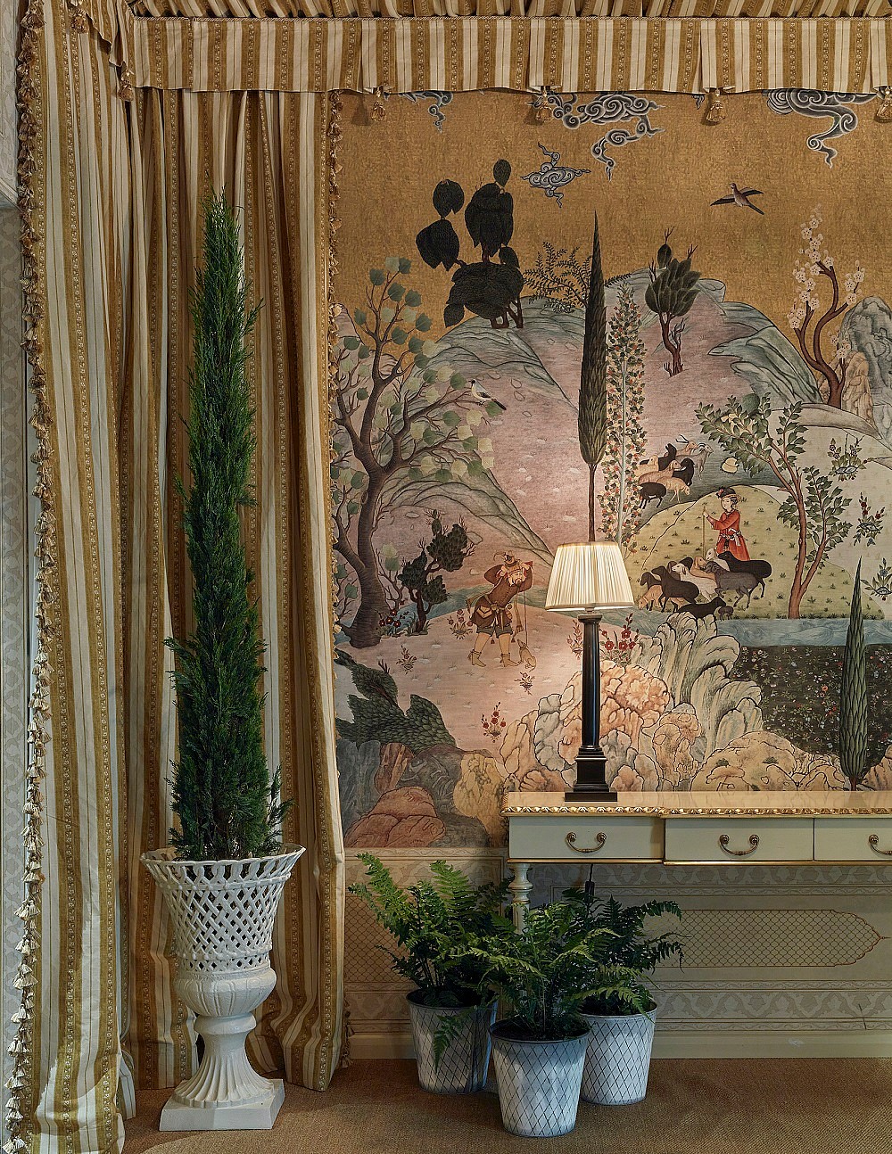
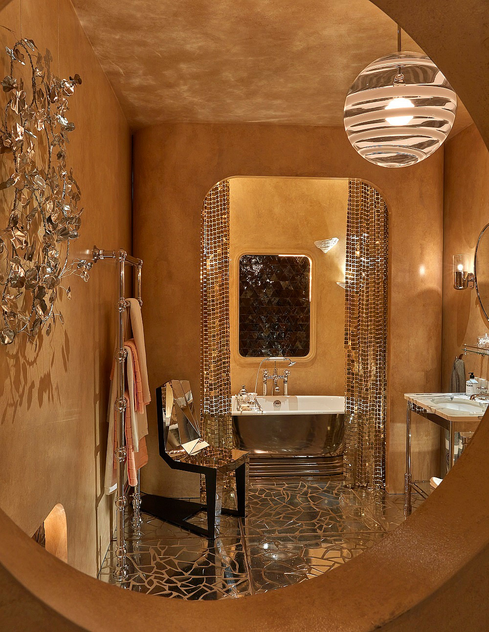
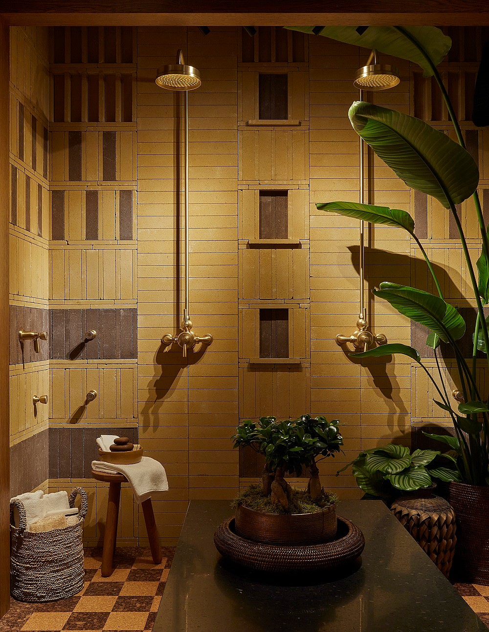
In Iksel’s Entrance Foyer, Mark D. Sikes mixed and matched fabric and wallcovering from Iksel’s new Safavid collection with sumptuous gold-coloured passementerie from Houlès; the Drummonds Principal Bathroom by Barlow & Barlow featured rough-plastered ochre walls; and the House of Rohl bathroom was a study in multiple shades of brown and ochre, full of earthy materials and rich textures, from clay tiles and checkerboard cork flooring to rattan bowls.
A trick of the eye
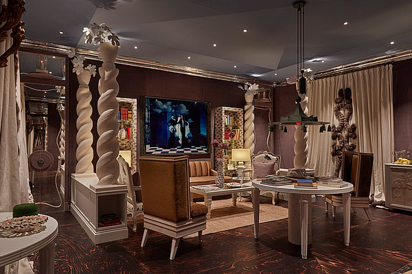
“Trompe l’oeil is the name of the game in decoration. You don’t want things to look too real. Awful!” So said Nicky Haslam at the WOW!talk he took part in, along with his design partner for the WOW!house Legend Room, Colette van den Thillart. Haslam is known for the theatrical flair that he brings to his work, and the Legend Room had a stage-set quality, with low walls and twisted columns that created a perspective that drew the eye into the room’s main seating area.
There were plenty of other examples of visual trickery within the rooms, too. Joy Moyler created a sense of place in her Dining Room with a huge lightbox mounted with an image of Portofino – the view from one of her client’s houses. In the House of Rohl bathroom, clever lighting silhouetted tropical plants against a screen of fabric, suggesting the lush imaginary garden just beyond the window that designers Studio Mica wanted to evoke: is it Brazil, Japan or Ibiza?
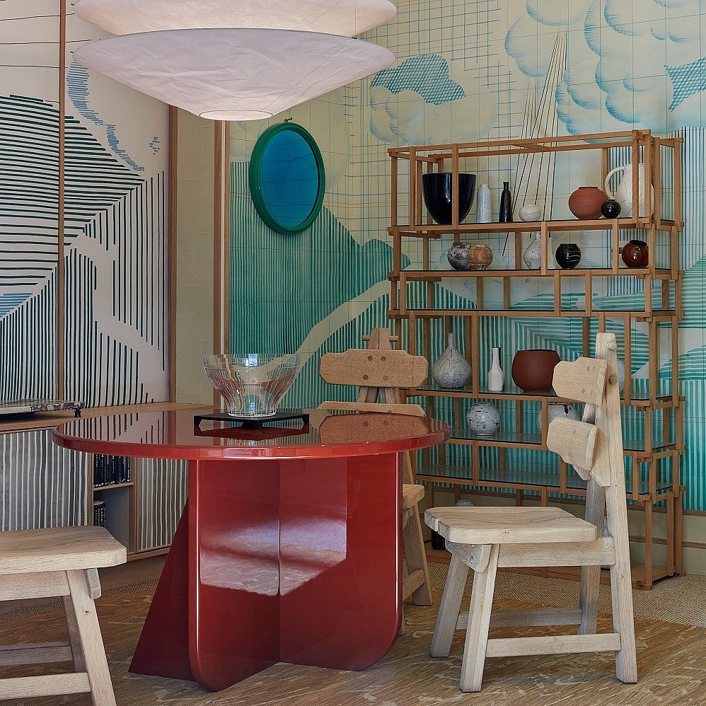
Designer Tom Bartlett’s Morning Room for sponsor de Gournay featured a tour-de-force hand-painted wallcovering that was a perspective architectural sketch writ large, with a viaduct receding into the distance, a rain-lashed cloudy sky and rolling hills. Bartlett’s design started life as a coloured-biro doodle in his graph-paper sketchbook but he also looked at sources such as Hogarth etchings and David Hockney’s opera sets. Altogether it represented a departure for de Gournay, known for traditional scenic painting, proving that its work is all about bringing to life a creative brief, whatever it may be. Bartlett amplified the trompe l’oeil even further with a tongue-in-cheek bespoke rug that was intended to look like floorboards.
Totally Floored
Not a surface was ignored in the WOW!house rooms. The 2023 edition built on last year’s trend for beautiful ceiling treatments (Joy Moyler had a thatched roof in her dining room, while for the Martin Moore kitchen, Henry Prideaux specified a metal-leaf wallcovering from Altfield, whose metallic gleam was perfect for catching the sparkle of the room’s gold disco ball). However, this year also saw some incredible flooring that ensured visitors looked down as well as up.
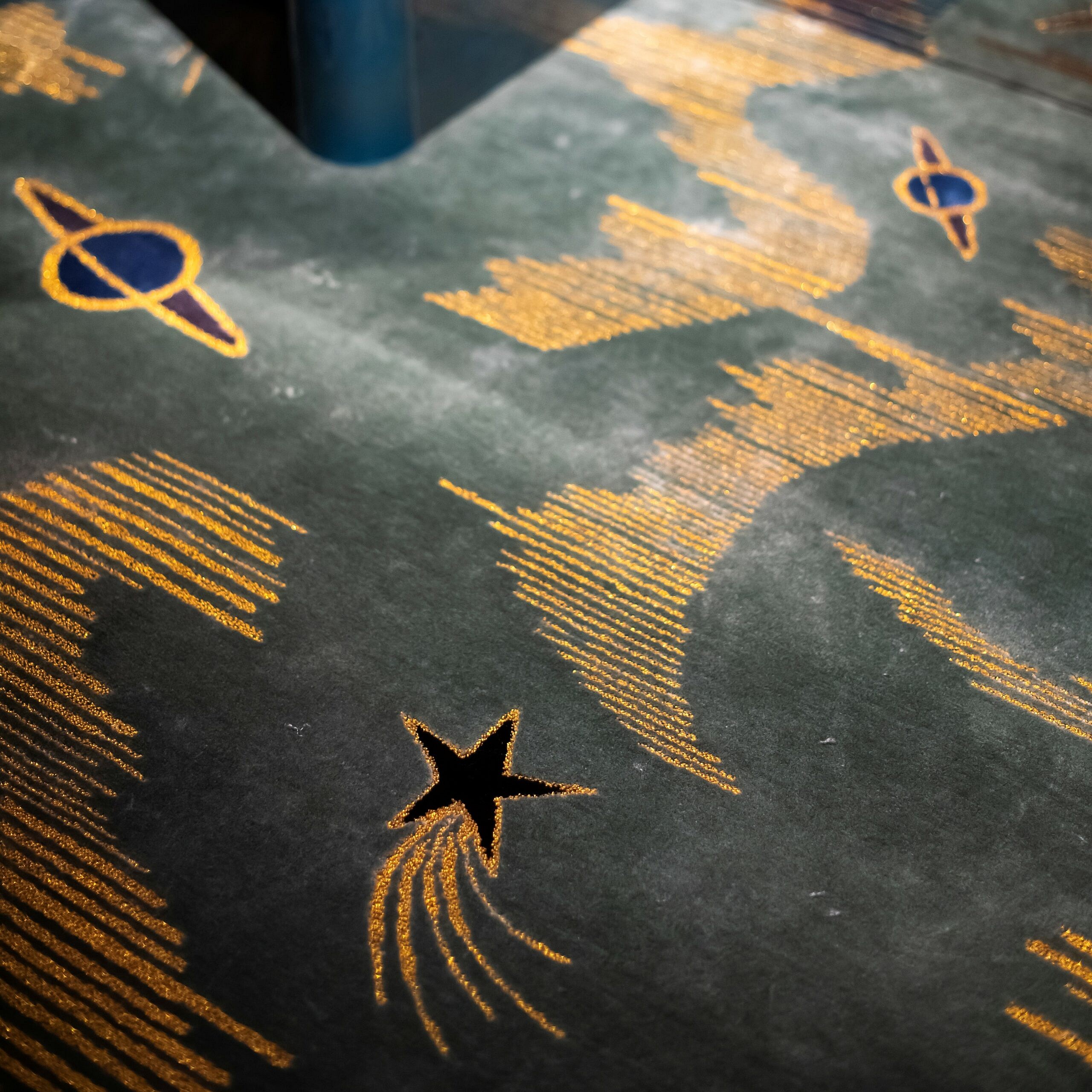
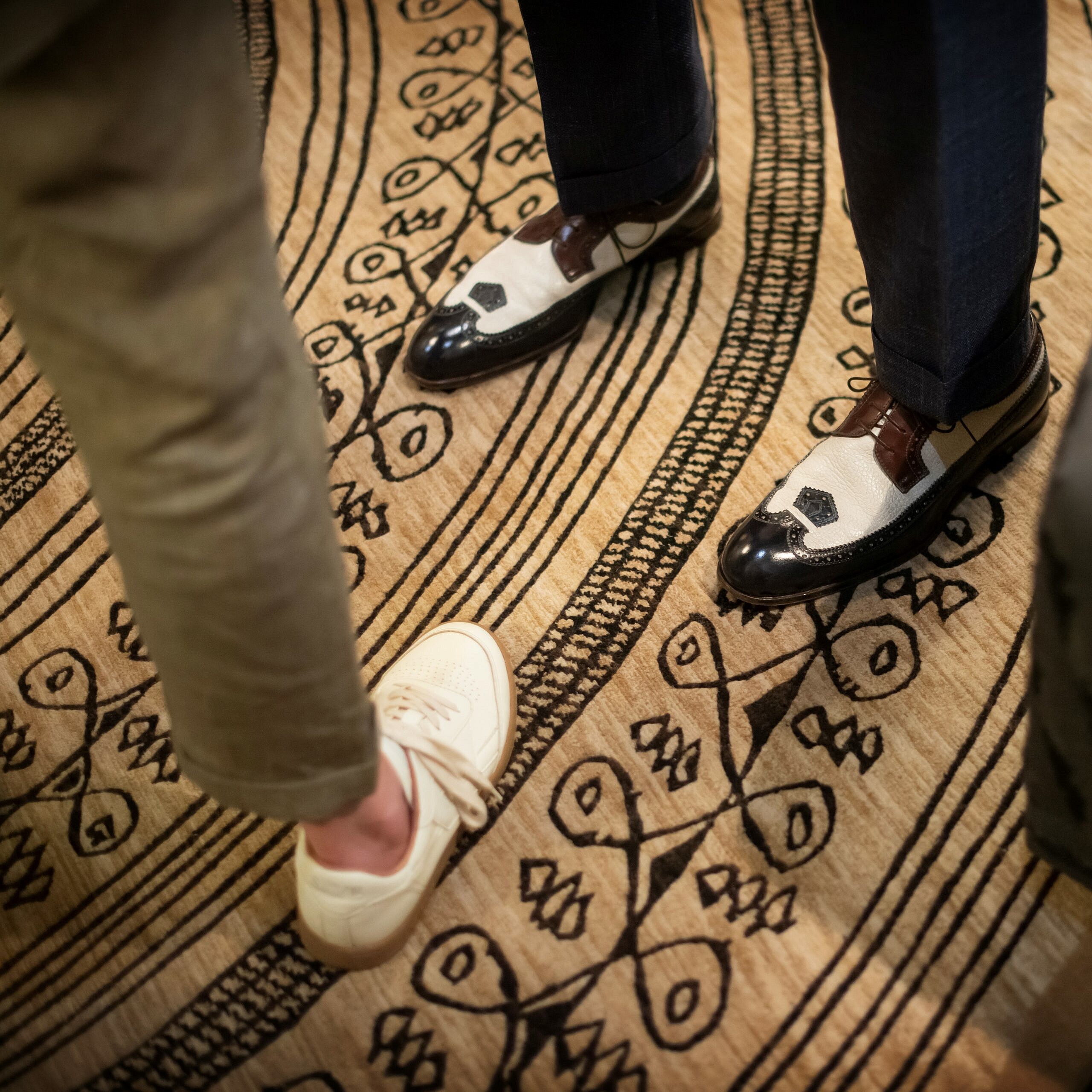
There was scorched-plywood in the Legend Room; a sumptuous deep-pile rug hand-knotted with wool and lurex by Maddux Creative in the Fromental Courtyard Room; and a planet- and shooting-star-studded rug custom-made by Tim Page Carpets in Tala Fustok’s celestial Home Bar. Jennifer Manners Design’s round rug for the Day Room was made to the specification of room designer Timothy Mather – with Mather’s starting-point loose sketch having been beautifully interpreted to fit in with the deco-era inspiration of the room.


