First Look: Purple
Purple has connotations with opulence and power. Its association with nobility – from Roman emperors to royalty – stems from the fact that purple dye, extracted from sea snails, was once so exorbitantly expensive that only a chosen few could afford it. This regal association was also the reason why purple was chosen as the colour of the suffragette movement: “It stands for the royal blood that flows in the veins of every suffragette, the instinct of freedom and dignity,” wrote the editor of Votes for Women, Emmeline Pethick-Lawrence. It still represents the feminist movement thanks to its association with International Women’s Day.
Purple is also linked with spirituality, mystery and magic, and it still has that luxurious, otherworldly quality, despite the fact that the dye itself has long since lost its rarity. It’s a colour that can fall in and out of fashion, but it is definitely seeing an upswing at the moment. Design Centre, Chelsea Harbour’s First Look online initiative sees hundreds of new products for spring/summer expertly curated by colour, and there are plenty of products to choose from in this regal hue, making it the perfect starting point for a design scheme.
First Look’s ‘Plum to Pink’ board includes rich, deep aubergines that almost tip into chocolate. Many designers use this tone as a “new neutral” – it’s warmer and less harsh than black and works well as an accent colour, on a statement lamp or trim, creating a striking design statement with an element of surprise.
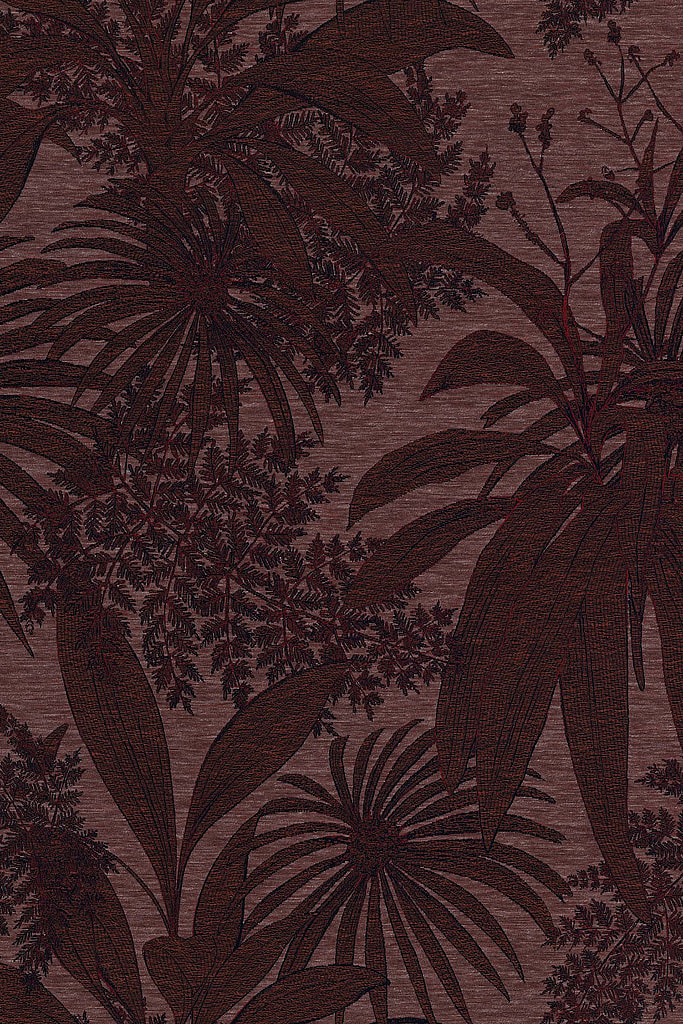
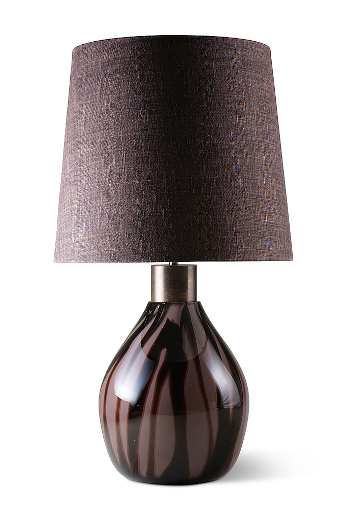
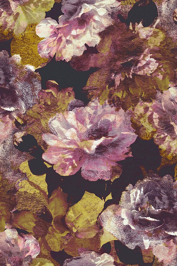
Sahco’s ‘Tropic’ fabric (above left; available from Kvadrat at Home) is a jacquard weave that uses a mixture of silky and matt yarns to create depth and texture in its lush design of silhouetted leaves. It’s beautifully matched with Porta Romana’s ‘Vespa’ table lamp (above centre),which takes its name from the Italian for ‘wasp’ – the dark stripes on the mouth-blown glass base emulating the insect’s body. Rubelli’s ‘La Vie En Rose’ fabric (above right) introduces tonal shades of pink and purple as well as a contrasting zingy green.
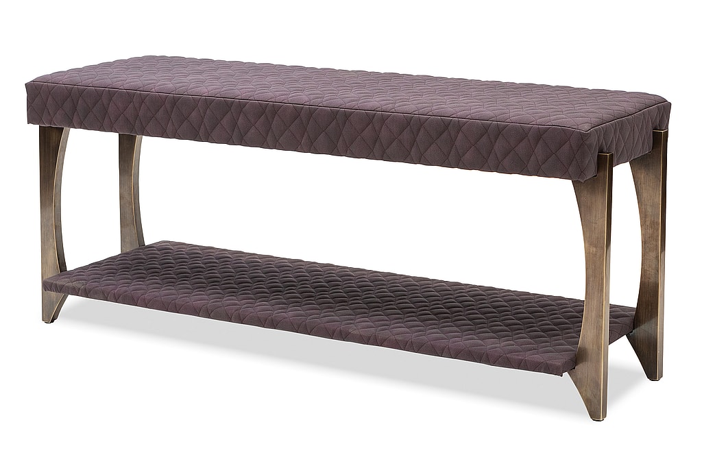
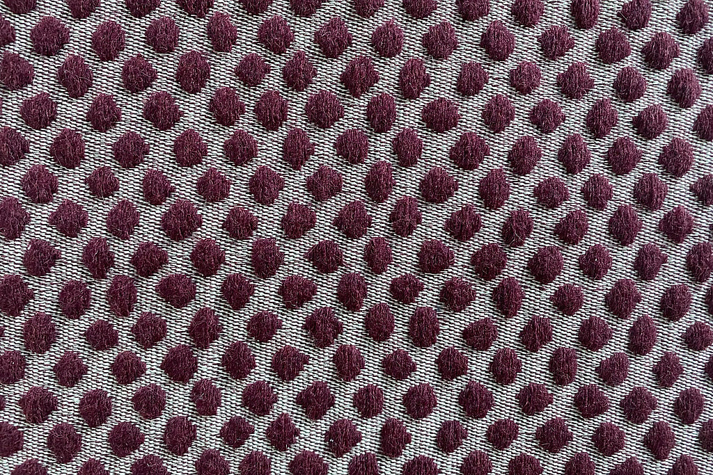
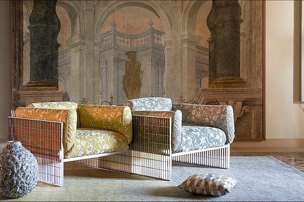
These darker berry shades add intensity and richness to design schemes, as shown in Simpsons’ ‘Belvedere’ bench stool (above left) and Lauren Hwang New York’s ‘The Dots’ fabric (above right; available from Alexander Lamont + Miles) whose fluffy tactility has a playfulness to it that tempers its masculine claret colour.
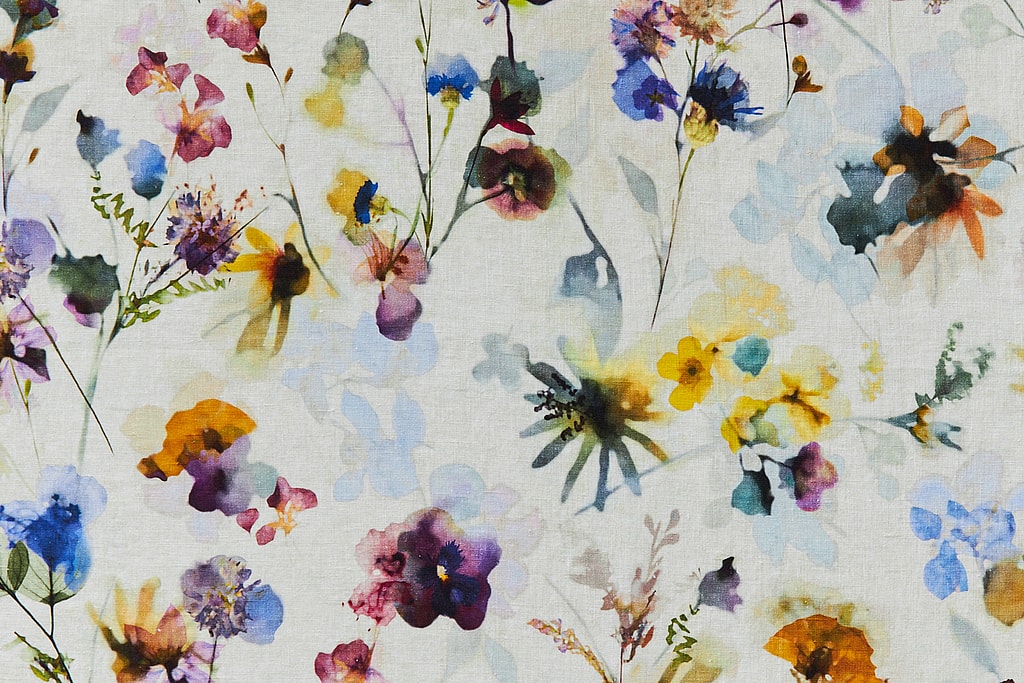
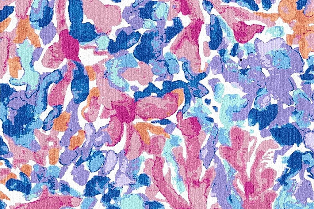
Purple can be romantic, feminine and uplifting, too. The transparent, layered effect of a watercolour is conjured up by both Etamine’s ‘Rose de Mai’ fabric (above left, available from Zimmer + Rohde) and Stark Carpet’s ‘Bromeliad’ rug (above right). Both use an uplifting combination of purples and pinks alongside splashes of hotter orange and yellow to deliver a sense of bountiful summer colour in full flow.
Visit First Look to browse hundreds of products, click on the ones you like and contact the showrooms directly for samples or further information. New designs are added regularly.
First Look acts as a preview to London Design Week 2021, where everything will be able to be seen in person.
Alexander Lamont + Miles, Second Floor, South Dome
Kvadrat at Home, Ground Floor, Centre Dome
Porta Romana, Ground Floor, Centre & South Domes
Rubelli, Ground Floor, Design Centre East
Simpsons, Ground Floor, Design Centre East
Stark Carpet, Third Floor, South Dome
Zimmer + Rohde, Ground Floor, North Dome
See more products like this on First Look:
![]()