Designer Loves: Mark Smith
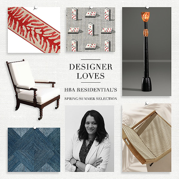
 As part of its First Look initiative, the Design Centre asked top designers to choose their favourite products from spring/summer 21’s collections. Mark Smith describes his finds below, and also explains more here about his preferred palettes.
Did you discover anything on the First Look colour wheel that surprised you?
It’s very easy to stick to what you know, but this experience definitely encouraged me to look outside of my usual boundaries.
Is there a colour you are consistently drawn to in your work?
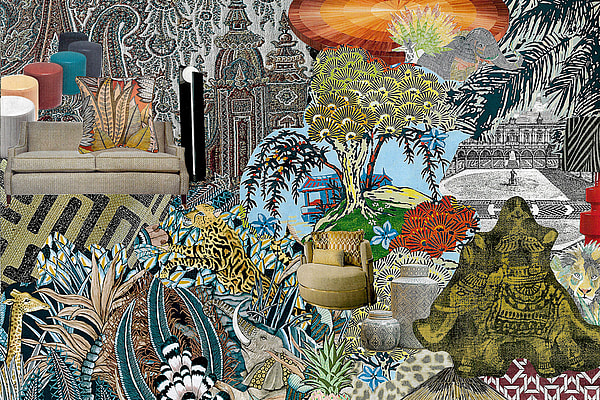
I’m obsessed with green but it has to be at the very least mid-tone and preferably very dark. In fact, all the colours I like/use tend to be darker – aubergine, indigo, chocolate etc, mixed with stone paint colours as neutrals and warm earth tones like caramel, verdigris and bronze, and reclaimed timber for atmosphere.
What timeless colour should we all be embracing this year?
It’s difficult to tell someone what colours to use – it’s very subjective and people react to different colours in different ways. Also, we designers tend to work with a signature colour palette that doesn’t alter much with time. For me, one constant are the stone colours used in classical architecture. And the darkest green one can find!
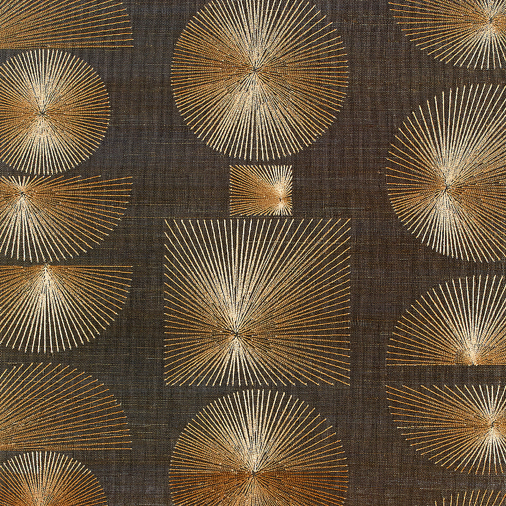
- ‘Parasol Stitch’ wallcovering, Phillip Jeffries: “Phillip Jeffries’ wallcoverings are a great way of introducing texture into a room, especially when the palette is quite subdued and the fabrics are on the plainer side, or if the space lacks interesting architectural detail”
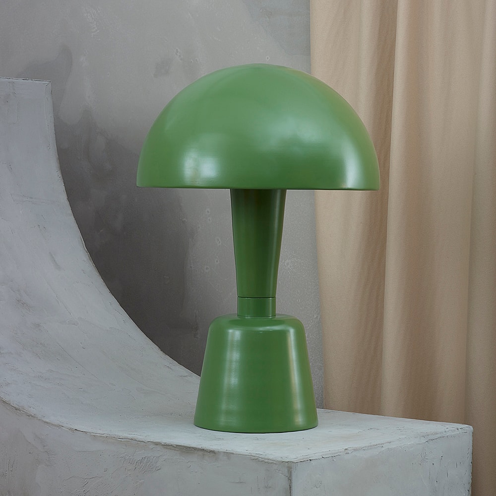
- ‘Large Cep’ table lamp, Collier Webb: “I have a bronze version of this lamp in my study at home. It has a very pleasing, simple Bauhaus-like shape that fits with almost any period or scheme. Plus I’ve long admired the quality of Collier Webb’s workmanship and materials”
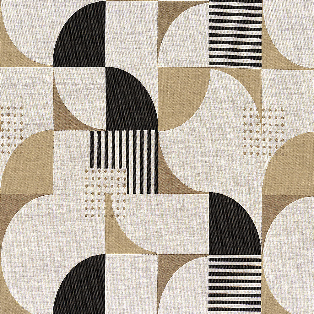
- ‘Nelson’ fabric, Casamance at Colony: “This fabric would be great covering a pair of tailored stools in a drawing room where the scheme might be otherwise relatively reserved”
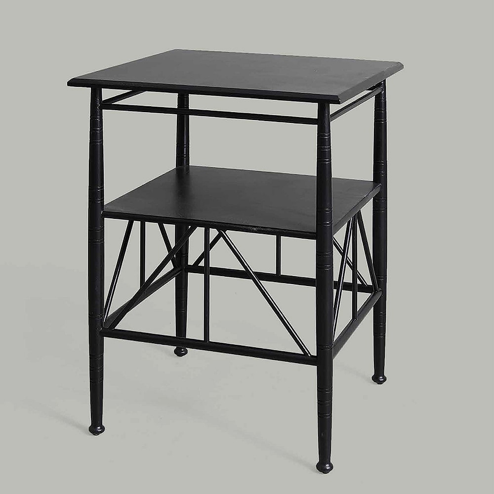
- ‘Inkpen’ table, Vaughan. “I’ve always loved Arts & Crafts and Aesthetic Movement furniture and this table is an obvious nod in that direction. In this smart black finish, it could work almost anywhere”
- ‘Atelier’ fabric, de Le Cuona: “De Le Cuona has a way of turning neutrals into elegant, tailored essentials. The ‘little bit of black’ (to paraphrase John Fowler) gives this a fabric a certain punch”
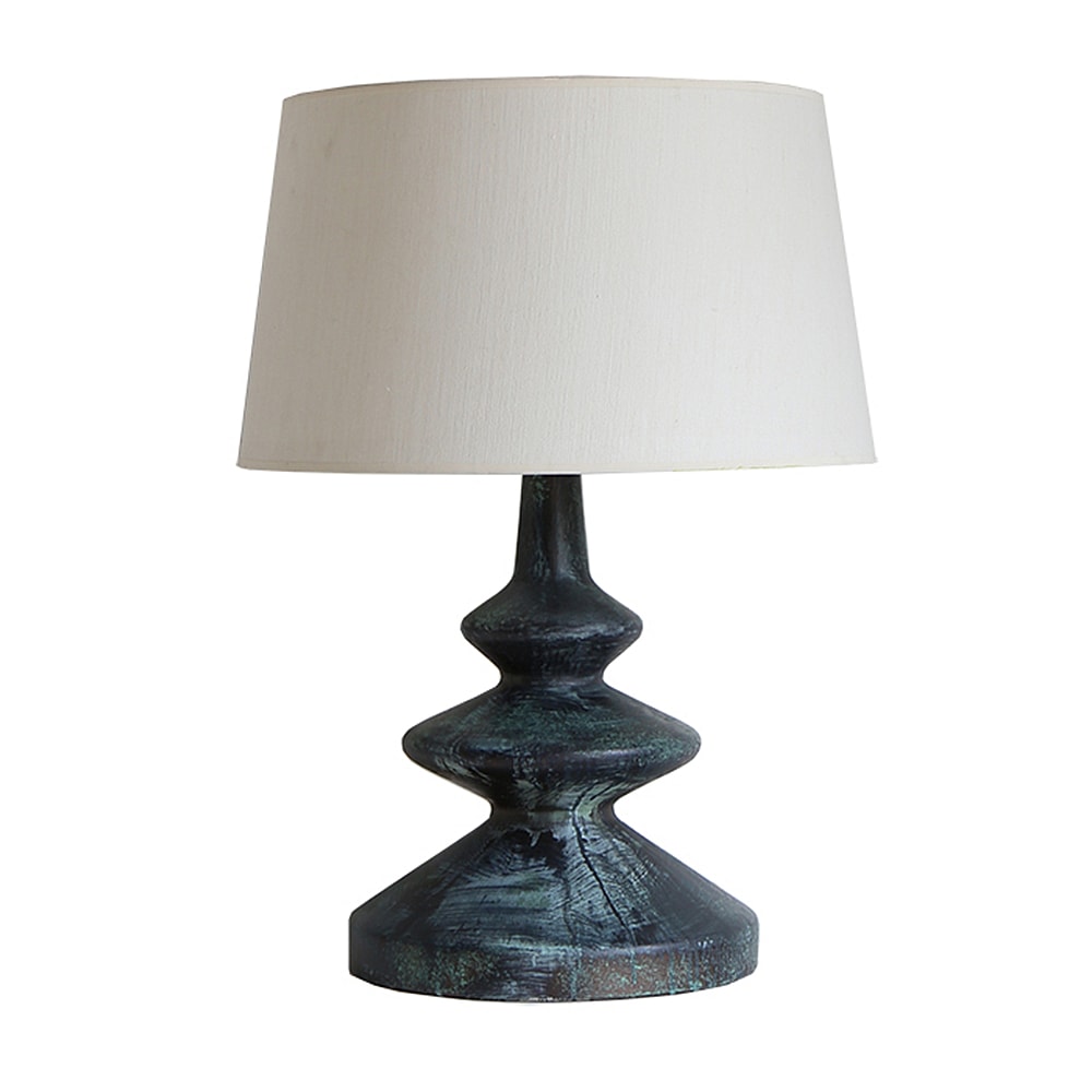
- ‘Frank’ table lamp, Paolo Moschino for Nicholas Haslam Ltd: “Who doesn’t love a bit of verdigris? I’d pair this with a textured shade maybe in the darkest chocolate brown”
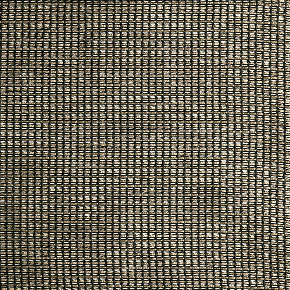
- ‘Ollone’ blind, Anne Corbière at Alexander Lamont + Miles: “I’m instinctively drawn to deeper colour tones and texture rather than a lot of pattern and this blind would really add some depth to a window treatment whilst creating an atmospheric, diffused light in the room. I use a lot of tailoring-inspired fabrics, so I can imagine pairing this blind with soft wool or cashmere curtains in the darkest bottle green”
Alexander Lamont + Miles, Second Floor, South Dome
Collier Webb, Second Floor, South Dome
Colony, Second Floor, Centre Dome
De Le Cuona, Second Floor, North Dome
Paolo Moschino for Nicholas Haslam Ltd, Ground Floor, Centre Dome
Phillip Jeffries, Second Floor, North Dome
Vaughan, Ground Floor, South Dome (just outside)
See more products like this on First Look:


